Letterboxd (spec)
Role | Product Designer
Type | Mobile app redesign (spec)
Challenge | Encourage more efficient browsing and social-savvy connections from an app intended as a social network for cinephiles.
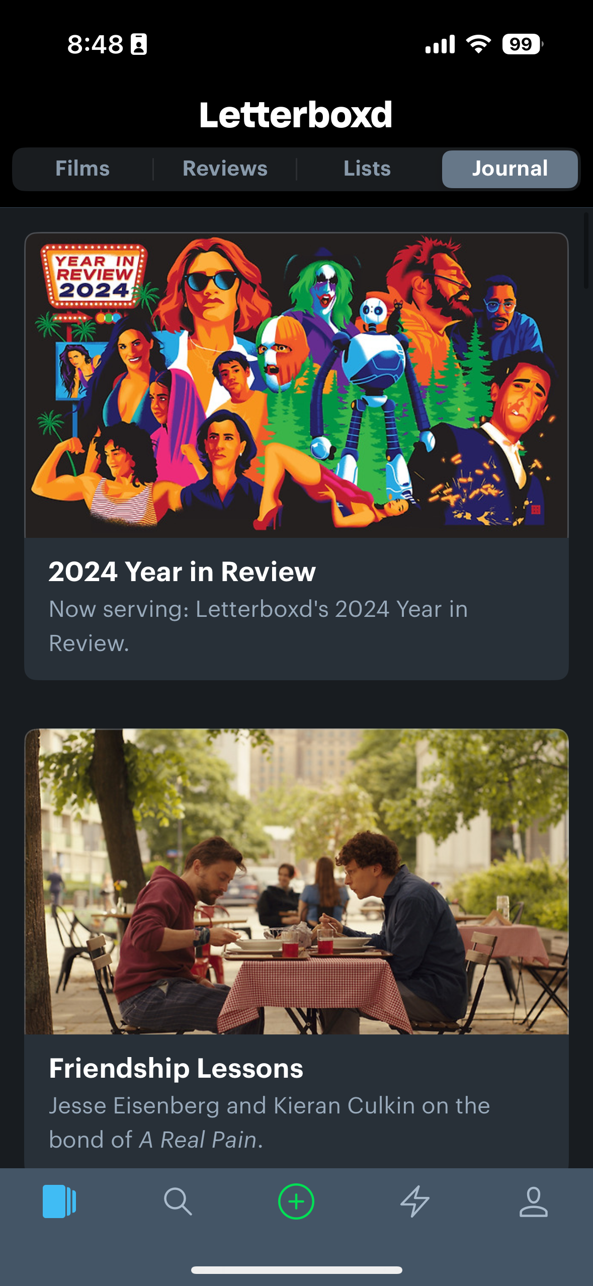
BEFORE
AFTER
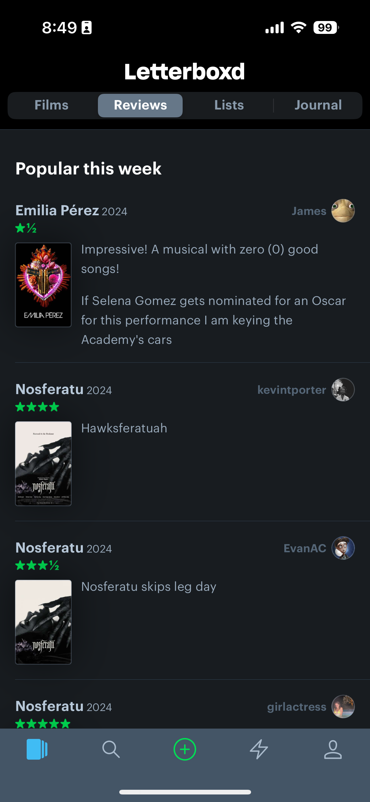
BEFORE
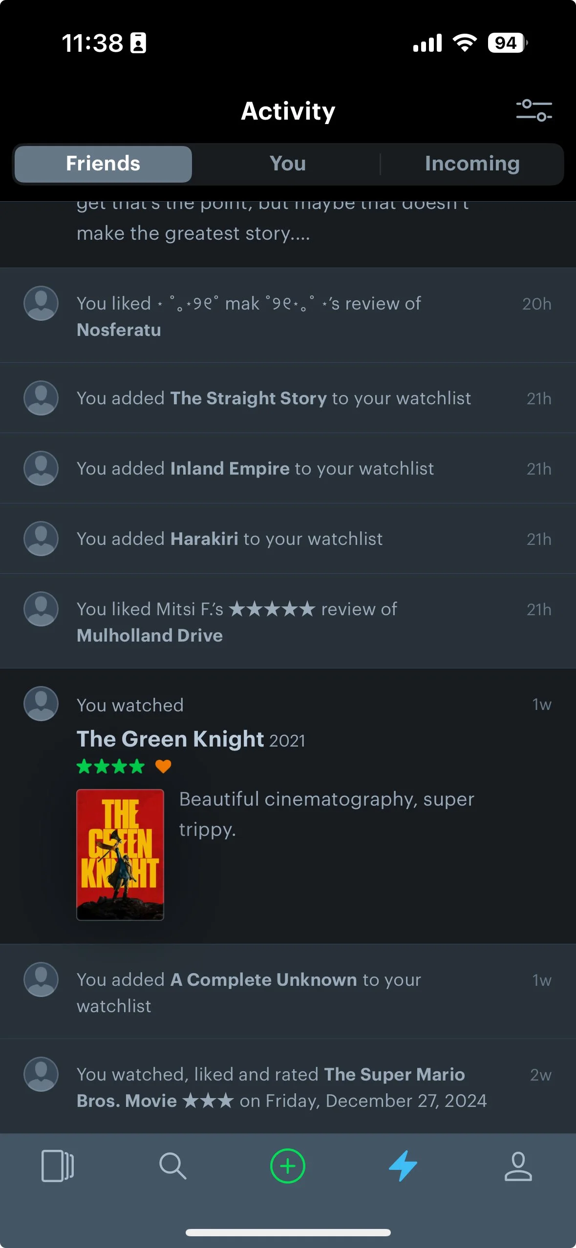
after
before
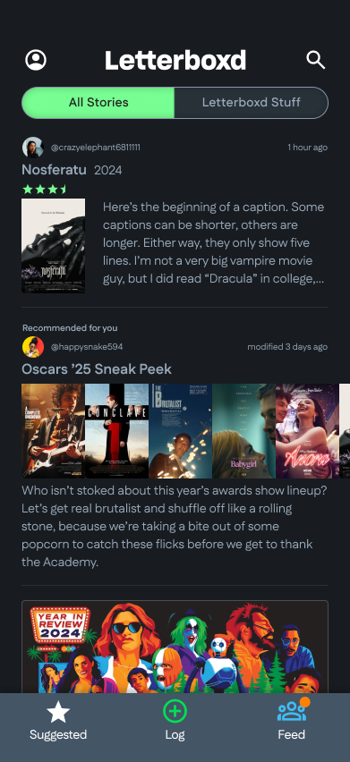
after
I consider myself a film buff of sorts. I watched Bergman, Fellini, and Welles for easy A’s in college. There may have been a semester or two when my verbiage at parties sounded like a Portlandia sketch.
I like to think that I’ve become more sufferable since then, yet my appetite for the silver screen and buttery popcorn remains strong. But with so much content that’s instantly available in 2025, I’m bound to miss a few movies.
It’s no secret that listmaking is beneficial for our productivity and mental health. I especially love the dopamine hit I get when crossing off a to-do. It’s easy to see the appeal of, say, an app that lets you track and log your movies and watchlist. So I turn to Letterboxd, a film listing and review app, as do thousands of others.
Letterboxd styles itself as a niche social media platform for cinephiles. It gets about half of that right. Which is a shame, because they put out great interviews with writers and directors. Even some of the randos’ reviews are quite good or even funny, like this one for Mulholland Drive (RIP David Lynch):
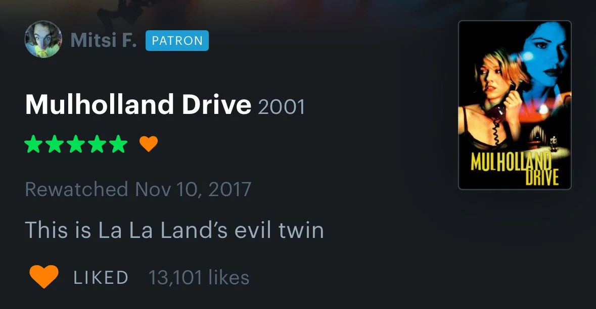
Hilarious.
The problem with Letterboxd is that I have to hunt for valuable content. Making connections on the app is wayward, if not esoteric. I’m not the only one who’s noticed that the app falls short of a two-thumbs-up review. Take a look at what others have to say on the App Store:


To be clear, Letterboxd is a great app. But there’s a lot they could do to make the experience better.
Decluttering the Letterboxd home screen
What it is
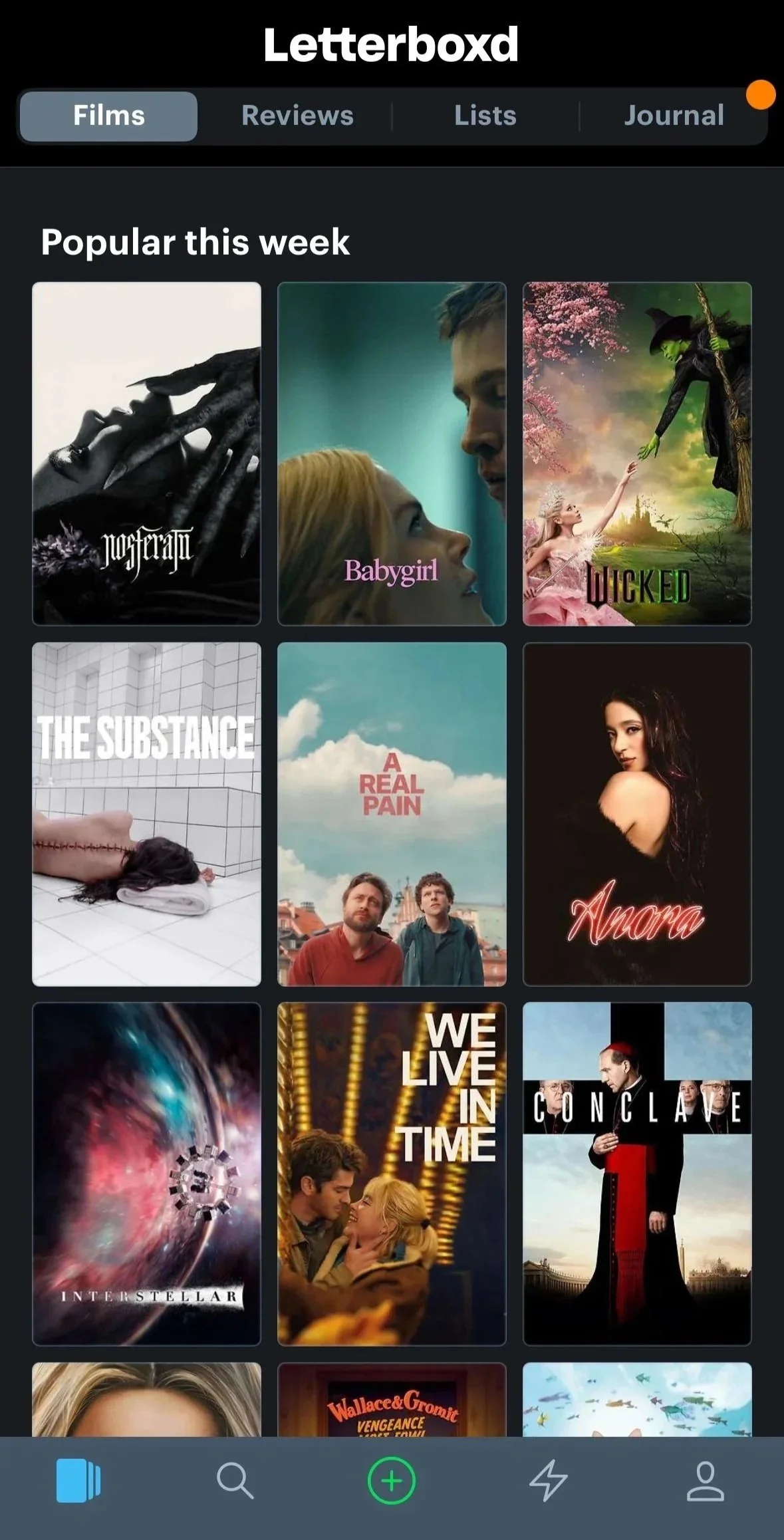
The paradox of choice is a common problem: We’re more likely to make a decision when we have fewer options. Letterboxd’s current homepage does little to ease this potential problem.
Letterboxd lists its recommended movies as “popular,” but that doesn’t help the user understand why or how. Interstellar is an excellent movie … from 2014. But what if I’m looking for something playing at my local theater? How about if it’s streaming on one of my favorite subscription services?
And what about those icons, by the way? I’m familiar with the magnifying glass and person icons — probably Search and Profile, respectively — but what’s with the lightning bolt?
What it could be
Streaming platforms figured out years ago that presenting lots of options at once leads to decision paralysis. Instead, users are more likely to make decisions when we reduce and weight their presented options.
The redesign categorically separates films based on popular criteria. This adds context and social proof critical to decision-making, like what your friends are watching or what’s playing in theaters.
Users customize their preferred streaming services, like Amazon Prime here, reducing the hassle of jumping around apps.
The horizontal scrolling presents fewer options and focuses the user’s attention. This has two benefits:
Some stakeholders might worry this limits choices and reduces user satisfaction. But it has the opposite effect. Limiting displayed options usually allows users to make quicker decisions. If they’re dissatisfied with those for some reason, they can always search to find something more specific.
Movie posters are larger, increasing accessibility and the design’s aesthetic appeal.
Finally, we opted for a simplified navigation and added text labels to increase user recognition. We changed the lightning bolt Activity icon to “Feed” (more on that later) to combine creative content similar to social media apps. Adding the Search and Profile functions to a utility navigation offers quick access to secondary functions without cluttering the menu.
Finding people to follow
What it is
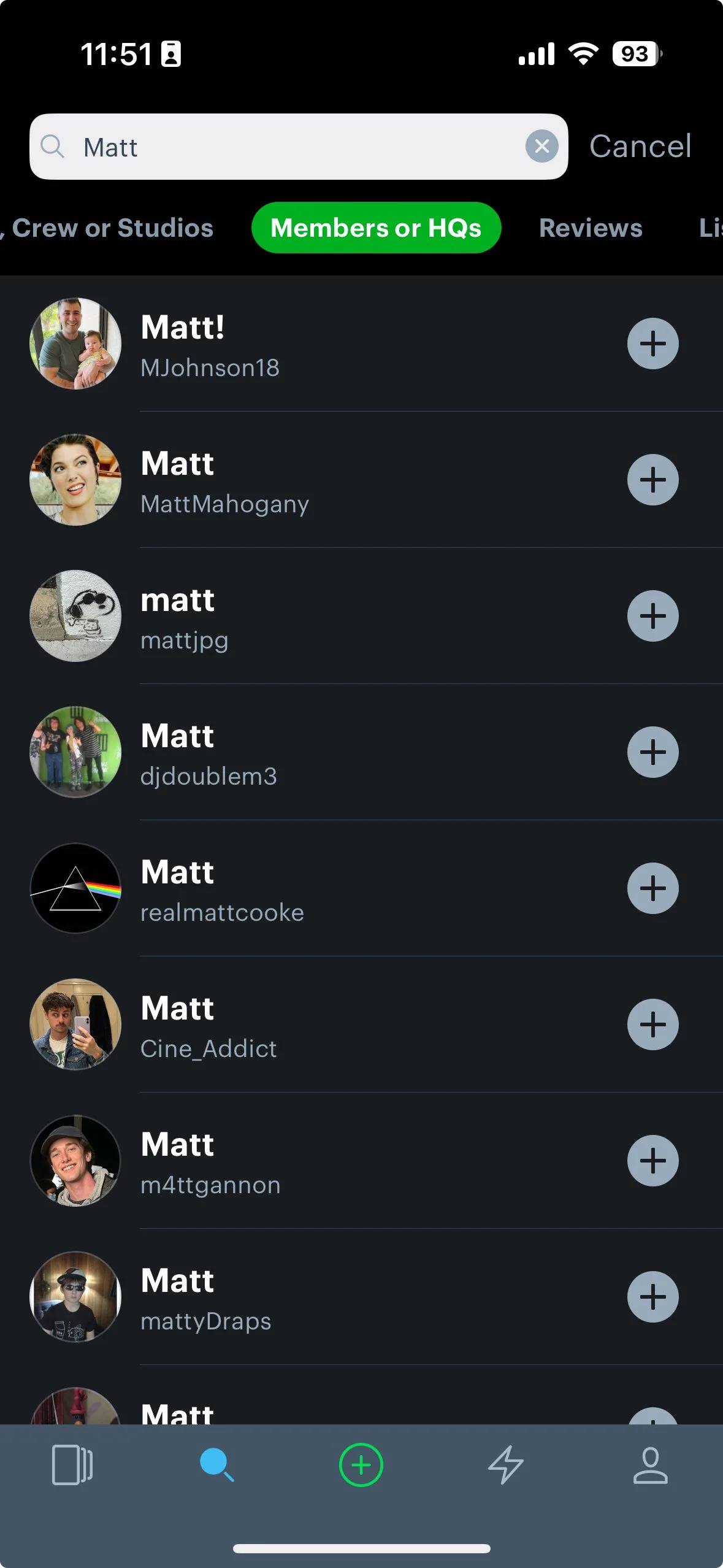
Engaging with other Letterboxd users, particularly ones you know personally, is a challenge. I can find popular reviews from that week, but finding specific people who aren’t the top 10 most active users is near impossible. Where are the other cinephiles? I would imagine I could do that from the Profile page, but no dice. I could search for them, but that assumes I know their alias and/or username.
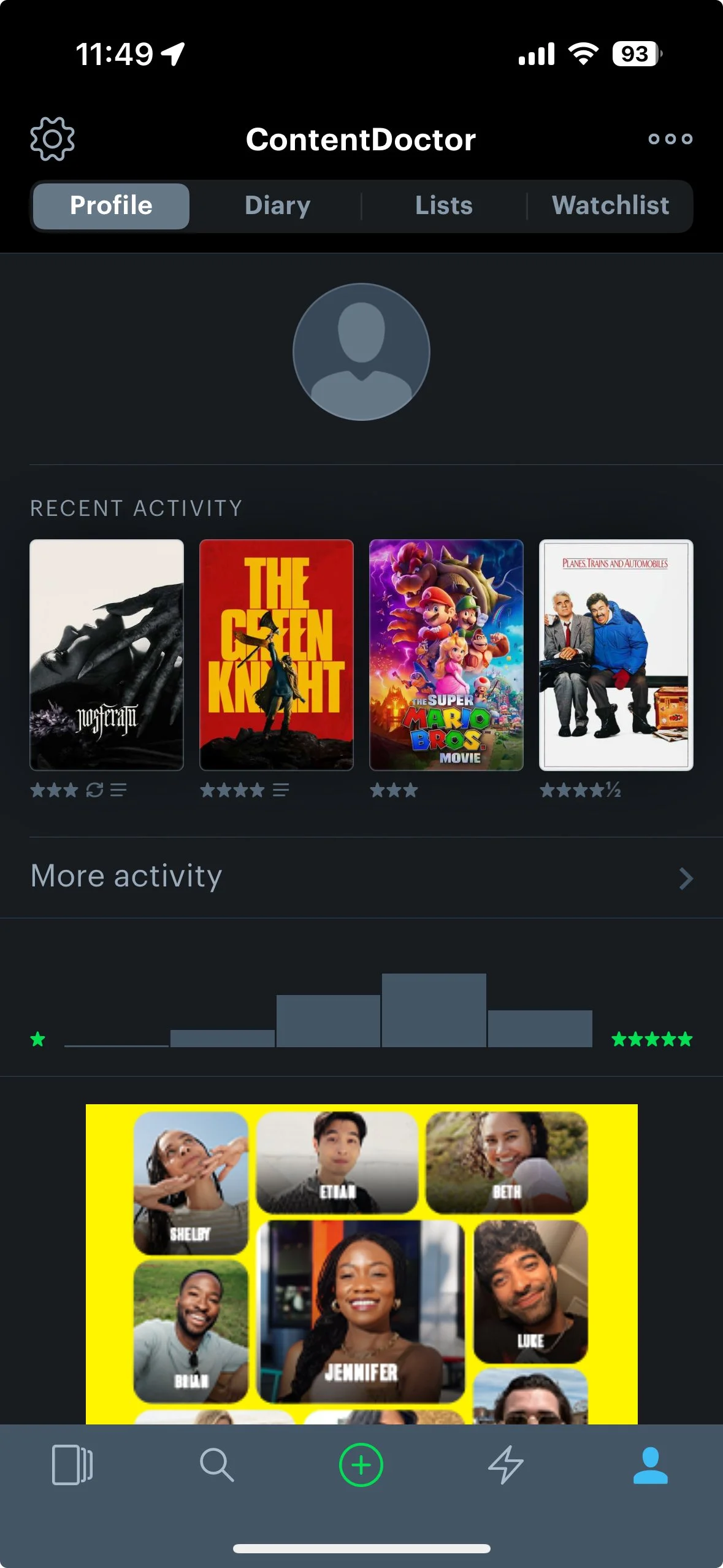
The problem stems from a clear case of ignoring both the business’ and users’ objectives: connecting film lovers. It’s like the credits rolled and the lights never came up, so I’m still sitting in the dark.
A solution with fewer conditions is one that is more likely to make sense. In other words, Letterboxd could remove complexity by making those user connections themselves.
What it could be
If Letterboxd wants to position itself as social media, it would make sense for them to emphasize that feature on its own platform.
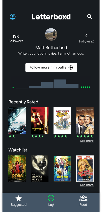
I added a clear call to action on a redesigned Profile page.
I imply more perceived value in interactivity with the inclusion of “Following” and “Followers” metrics. Users could also tap these areas to view a full list of their followers or who they’re following, allowing a secondary CTA in that nested space.
I also removed the secondary nav at the top of the page to focus on the primary actions. Those secondary functions are now added below the main profile information.
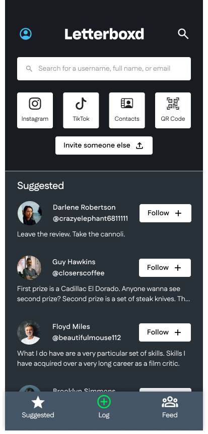
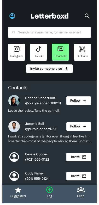
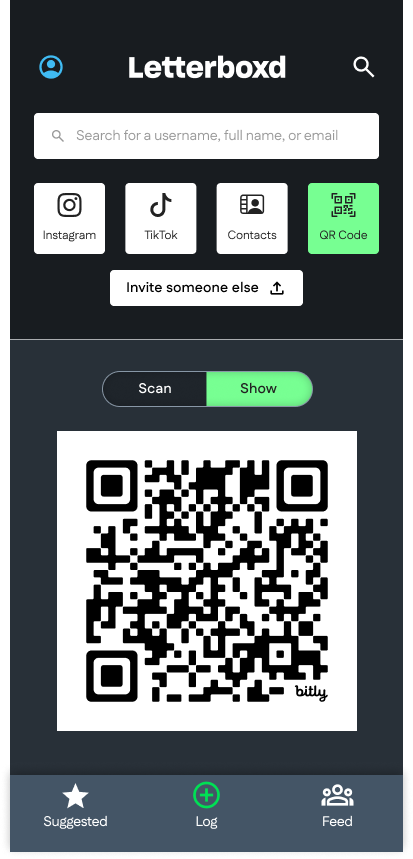
Tapping the “Follow more film buffs” button also leads the user to a number of different methods for them to add profiles to follow.
Following the Robustness Principle, we increase the number of methods that we use to accept inputs, while simplifying the number of outcomes. Users may choose from a number of different connection methods, including social media integrations, to find and invite people they already know to join them on Letterboxd.
Centralizing creators’ content
What it is
Content consumption is simply too disparate on Letterboxd. “Journal” is too vague — my journal? Or Letterboxd’s? These are all secondary navigation items from the main screen, which looks like a catchall for all things Letterboxd couldn’t figure out how to categorize.
Let’s not forget this secondary navigation is also unnecessarily redundant. I can find similar content in Activity with clumsier, more cramped design elements.
While one section lists popular reviews and the other lists personal activity, navigating to two separate places to read reviews is far from streamlined.
What it could be
Let’s get rid of Activity altogether. It doesn’t have any particular purpose that isn’t already served We can also group the creative content together in a central consumption location.

We have a much more recognizable term, “Feed,” for this content.
A simple, bifurcated toggle suffices where the four-point secondary navigation was more likely to slow down user tasks.
Suggested follows could still be denoted within the feed with some short explanatory text.
A little user psychology makes a big difference
Products aren’t great just because someone builds it and the users come flocking to it. And just because I happen to like this redesign doesn’t mean that it would be a guaranteed success. Great user experiences happen in concert with:
A solid user research foundation
Intuitive designs informed by design best practices
Incremental improvements based on several interface tests and user feedback sessions